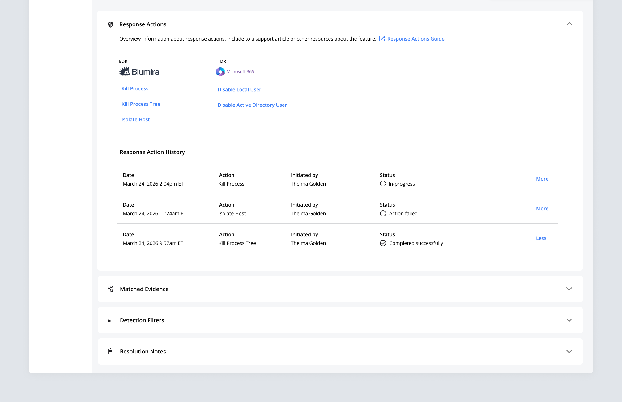
Blumira is a security monitoring platform (SIEM/XDR) that surfaces threats as findings for security teams to investigate. Threat Response lets customers disable a compromised user, isolate an endpoint, or kill a malicious process directly from a security finding, instead of switching into separate identity and endpoint tools. It builds on the Findings detail page, the most-used page in the product, which I’d redesigned during an earlier contract engagement. Threat Response was the bigger, more ambiguous challenge I was trusted with next: turning that page from a place to understand a threat into a place to act on one.
Blumira could already detect and prioritize threats, but resolving them generally meant leaving the platform. Several limited response actions existed, but they were confusing and nowhere near a complete response capability. Customers had been asking the Product team for a real way to respond inside the platform. To contain anything the existing actions couldn’t handle, customers pivoted into third-party tools, Entra, Active Directory, CrowdStrike, and others, or contacted Blumira’s SecOps team for guidance. For the small IT and security teams who are Blumira’s core customers, that friction cost real time during incidents where every minute mattered.
I worked closely with an Incident Detection Engineering colleague and a PM to scope each type of response action (isolating a host, killing a process, disabling a user, and more). Our working sessions set the requirements for the evidence a customer needed to see before deciding how to respond, down to the specific fields. Each week in our team meetings, I reviewed designs as they progressed to make sure I was on the right track.
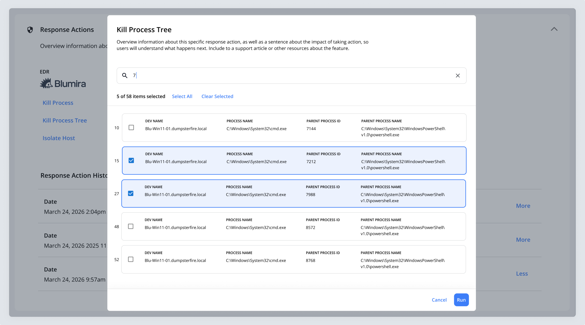
I designed for the most complex response actions first, Kill Process and Kill Process Tree, then applied that pattern to every other response action. Every finding has a matched evidence table that might display hundreds of rows of data. When a customer selects a response action, a dialog opens with the evidence they’ll act on. For Kill Process and Kill Process Tree, sixty or more rows of data needed to be displayed, each showing four pieces of evidence for review. No existing pattern in the product handled dense, variable-length review and selection like this, so I designed a new interaction model and UI pattern.
Static mockups couldn’t capture how selecting across a long, filtered list should actually behave, so I used Claude to structure a large, complex set of real finding data into a usable dataset, then built out the full interaction in HTML/CSS/JS using Gemini. That gave engineering a functional reference to implement directly, not just a static design to interpret.
For Kill Process and Kill Process Tree, I grouped each row’s four pieces of evidence into a card so customers can quickly parse them. Inside the dialog, they can search by process IDs, strings, or across the other evidence in a card to narrow a long list. Selected cards read clearly against unselected ones, and search changes what’s on screen but never what’s been selected. A customer can select a few evidence cards, search again, select more, and the running count carries every selection across each step. Keeping selections intact while the list changed underneath was the core of the interaction. Without it, anyone working through sixty rows would lose their place the moment they filtered.
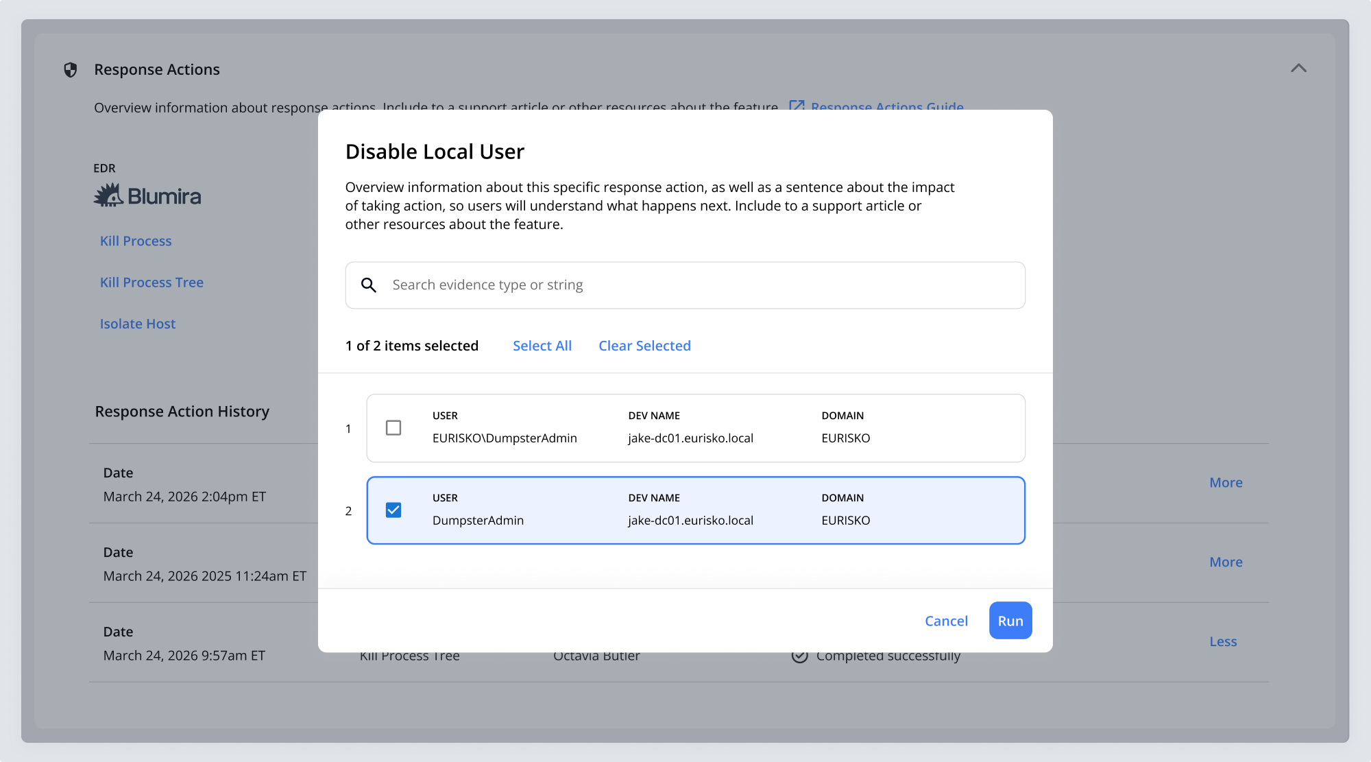
For actions requiring less data, like Isolate Host, Disable Local User, and Delete File, a customer sees only one or two cards and rarely needs to search, though search is still available. I kept the running selection count and the selected-card treatment consistent across every action. Keeping the pattern this lean was deliberate: I made the case against building a full filtering system, which for the majority of response actions would have been overengineered.
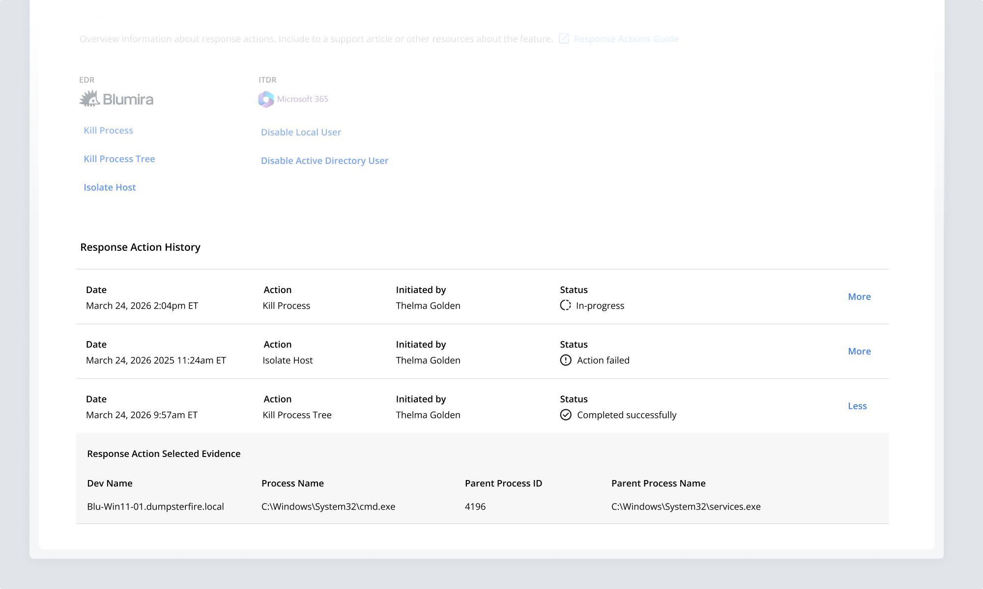
Running a response action is only part of the job. I designed a history table, which shipped within the new Response Actions section, recording every action taken on a finding: when it ran, who initiated it, and whether it ran successfully, failed, or is pending. Expanding a row shows the exact evidence that was selected when the action ran, so a team can see not just that a process was killed, but which one and on what basis.
Threat Response shipped and customers started using it right away. Customers finally had a real response capability, well beyond the handful of limited actions available before. A task that used to take 30 to 60 minutes, like revoking a compromised Microsoft 365 account across cloud and on-prem sessions, now takes a single click. TR Computer Sales, an MSP customer, described going from a multi-step, multi-tool process to resolving incidents in seconds, citing the ability to act in one click without toggling between screens as a key benefit (read the customer story).