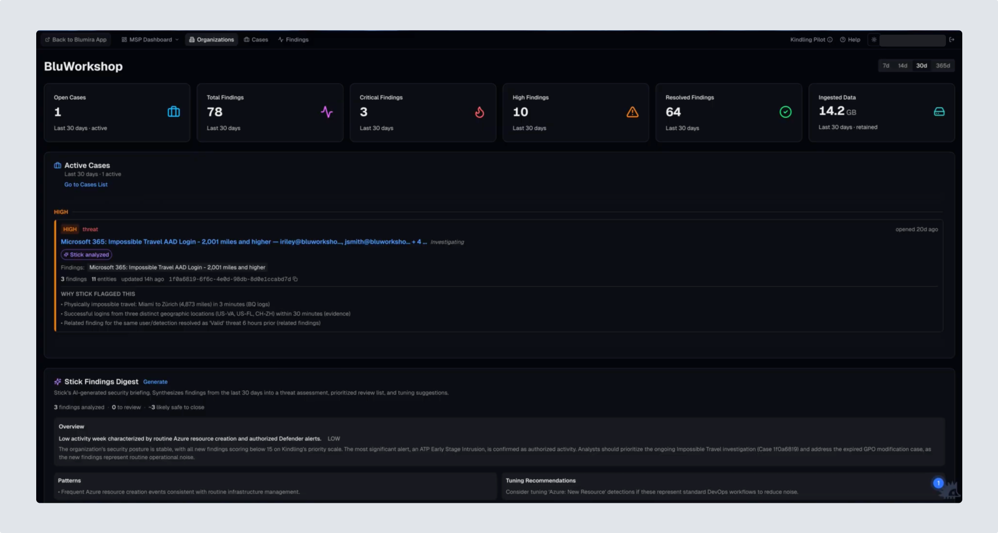
Blumira is a security monitoring platform that watches an organization’s systems and generates findings when activity looks suspicious. Kindling, a new product we built on top of that platform, auto-triages those findings and assembles the ones that need attention into cases. It draws on Blumira’s accumulated history: how an organization has resolved similar findings before, how others in the same industry address them, external threat intelligence, and the organization’s own behavioral baseline. Benign findings never reach the queue. Real threats arrive as a case, with related findings already connected and the evidence assembled, so teams spend their limited time on the handful of threats that actually matter. Kindling is built for lean teams that have no dedicated SOC and need to trust what’s in front of them quickly, like the IT admin at a manufacturer who doubles as the security person or the MSP analyst juggling dozens of client environments.
As the sole product designer at Blumira, I was pulled onto a small, fast-moving internal team with three senior engineers and a PM. Our task was taking an internal prototype to a customer-ready beta in six weeks. We shipped the first beta in early May 2026.
The screens on this page are stills from Blumira’s public product walkthrough and demo video.
The prototype proved the concept worked, but the experience around it needed design attention. Before designing anything, I went through the product page by page, annotating the screens with UX issues and product questions. Controls gave no signal about what would happen when you clicked them, and toggles made it impossible to tell whether they reflected the current state or the state they would activate. Hierarchy broke down at many levels, from components to full pages, leaving important actions no more prominent than minor ones. AI-generated summaries were hard to parse, and redundant data appeared in inconsistent formats, adding noise instead of clarity for the users it was meant to help.
The visual layer compounded all of it. Type ran as small as 8px on buttons and other elements people needed to read or click. Color was applied heavily but inconsistently, and many combinations failed accessibility contrast standards outright. In a security product color usually encodes severity, so a shade that looks meaningful but isn’t can lead someone to misjudge how urgent a threat is.
With no time for a traditional design process, I used Claude Code to design and iterate directly in code. I worked in my own branch, pulling down the latest code and reworking pages locally before pushing changes back up. My front-end engineering partner reviewed them, often alongside me. From there, he pointed his own Claude Code at the branch to apply the changes, sometimes working from handoff markdown files I had Claude Code write for him.
Working in the codebase allowed me to ask Claude Code questions I could not have asked from a design file: how a piece of data was generated, what it actually represented, and what it was supposed to communicate to the user. That meant I could either align the interface with what the data was meant to convey, or reframe the data into something a user could understand and act on. Every page and component I designed began with those questions, from the case detail and findings pages to Active Cases, Security Posture, and the Stick Findings Digest. Many components had shipped with no explanation of what they showed or what their numbers meant, so I added one for each.
I prioritized the problems that most affected whether someone could navigate the product, understand the security data in a case, and decide what to do. I reworked full pages and flows, built new reusable components, and established consistent interaction patterns across the product. The work included everything from fixing affordance mismatches in navigation and filtering, to building clearer workflows for updating a case’s status. Alongside engineering and our PM, I also partnered on defining the product’s user types and permissions model, using Figma to map the information architecture even though the interface itself was built entirely in code.
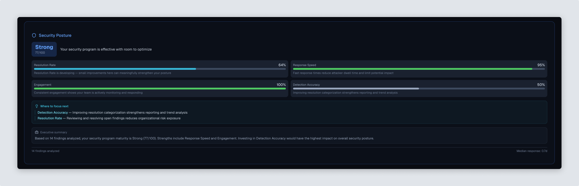
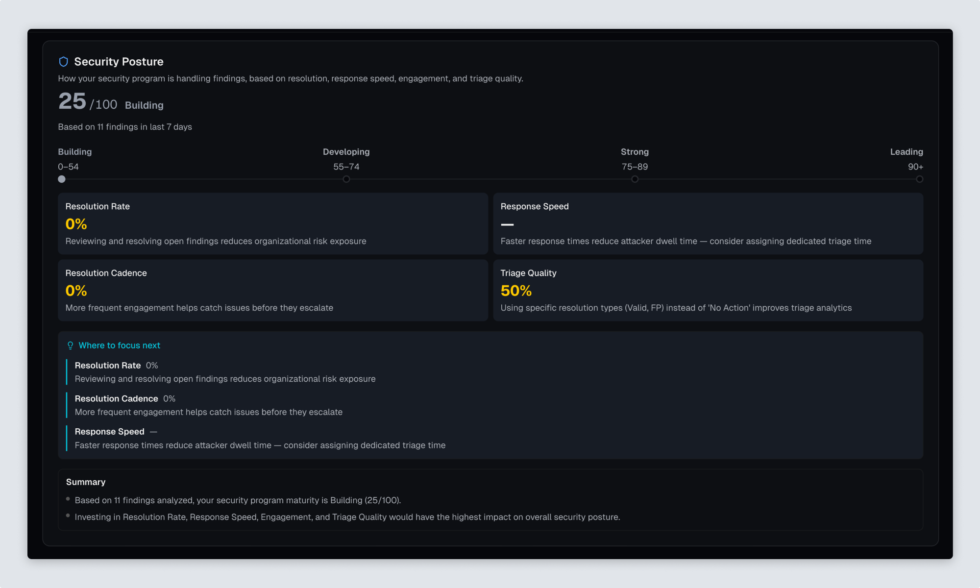
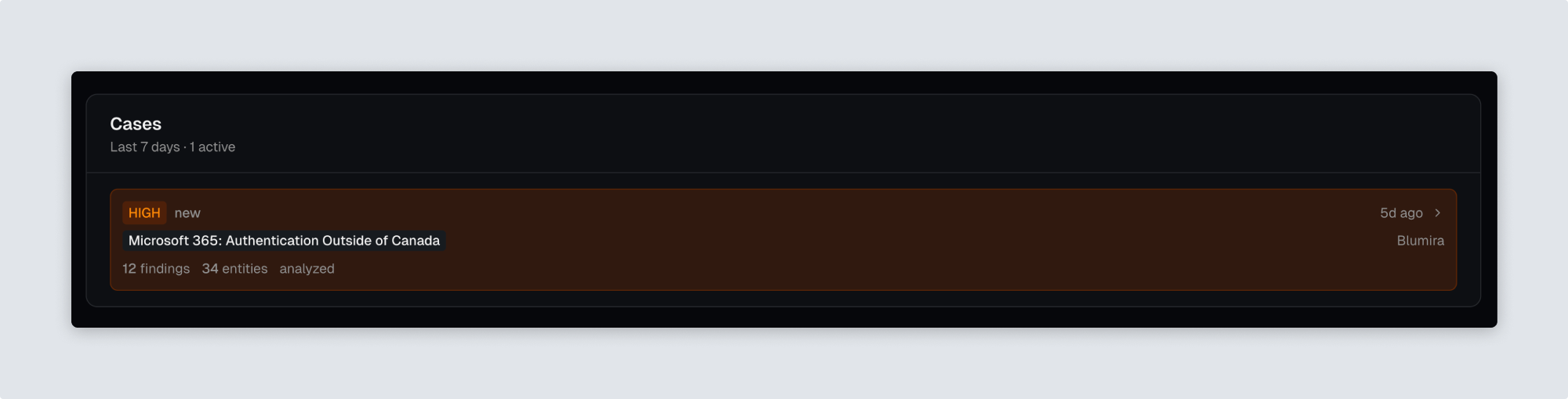
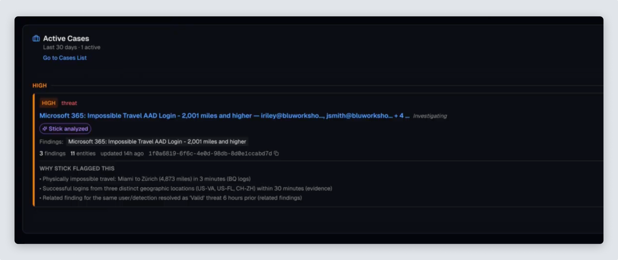
I reworked components across the product, most of them showing data without explaining it. Security Posture, on the organization dashboard, scored a customer’s security program without giving any context to the data points. The Cases component showed highlighted cases without saying why they had been flagged. In a product built on automated judgment, that reasoning is what earns a customer’s trust.
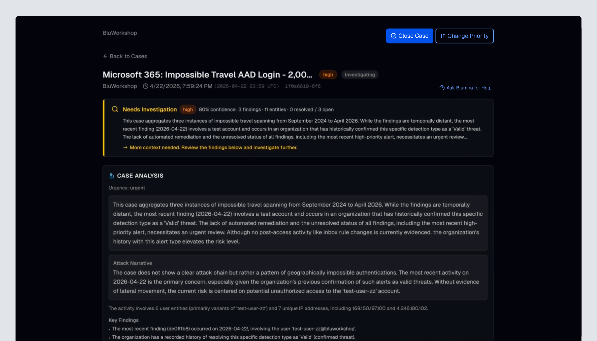
On the case detail page, seven differently styled buttons sat beneath the case title, mixing tasks that had nothing to do with each other. Some took effect the moment you clicked, with no confirmation beyond a status label quietly changing. I split them into two distinct paths and moved both to the top right, the highest position in the page hierarchy, since these were the most consequential actions available. Closing a case became the primary action, opening a dialog with a set of resolution options. Changing priority became the secondary button, using the same pattern. The primary and secondary button styles I built there carried across the rest of the product.
The findings list page needed the most work. Elements that looked like data cards were actually filters, and the finding cards themselves were entirely clickable with nothing to indicate it, so I made the filters read as buttons with clear selected states and gave each finding an explicit action to open it. Creating a case from a finding was broken in a subtler way: the button vanished on click, offered no way to reach the case it had just created, and reappeared on refresh. I replaced it with a confirmation step, after which the button becomes Jump to Case.
The same ambiguity showed up at the page level. Switching between findings with AI analysis and all findings ran through a single button reading “Stick Only” or “All Findings,” with no way to tell whether the label described the view you were in or the one you would get by clicking. There was also no way to isolate the findings Kindling hadn’t analyzed yet. I replaced the button with three tabs, each carrying a count: findings with AI analysis, findings without an analysis, and all findings.
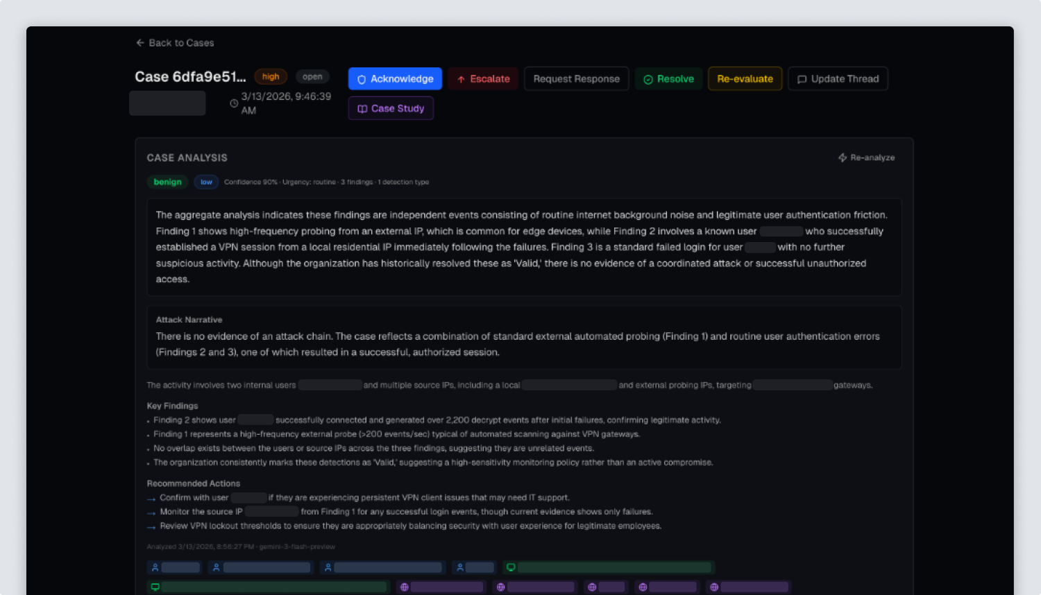
I worked closely with my front-end engineering partner throughout the project, pairing directly with him on rewriting the product’s design tokens and key components. Systematizing the tokens and components happened as I redesigned in the code, not as a cleanup pass afterward. Patterns that had grown ad hoc across the prototype became consistent ones, laying the groundwork for a lightweight, reusable design system going forward, rather than one-off styling decisions per screen.
Kindling’s agentic engine has driven dramatic reductions in alert noise for customers, in some cases up to 90%. The engine’s accuracy accounts for most of the reduction, but once the data and analysis are assembled into insights, an analyst still needs to be able to read them clearly and act on them under pressure. That’s where design came in. Between the internal prototype and the beta six weeks later, I rebuilt the interactions customers used, from moving through findings to acting on a case. I reframed dense correlated data into something an analyst could read and judge, and systematized the tokens and components underneath all of it.