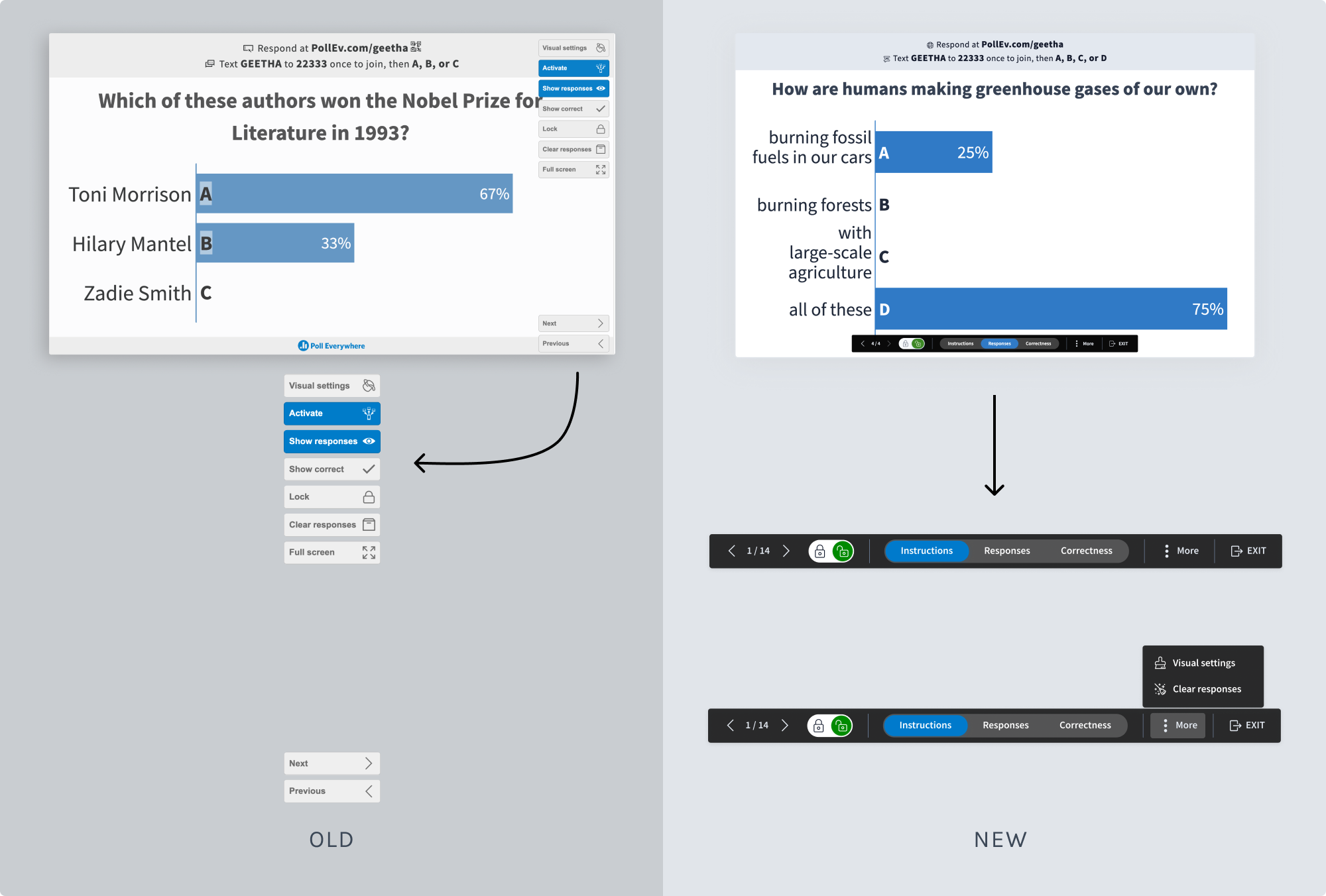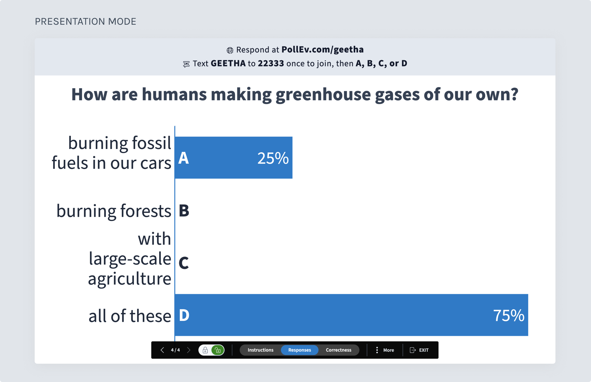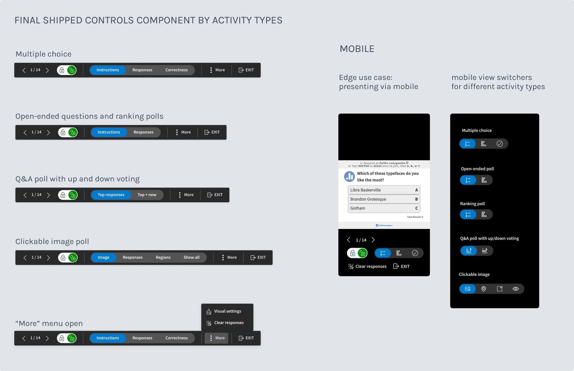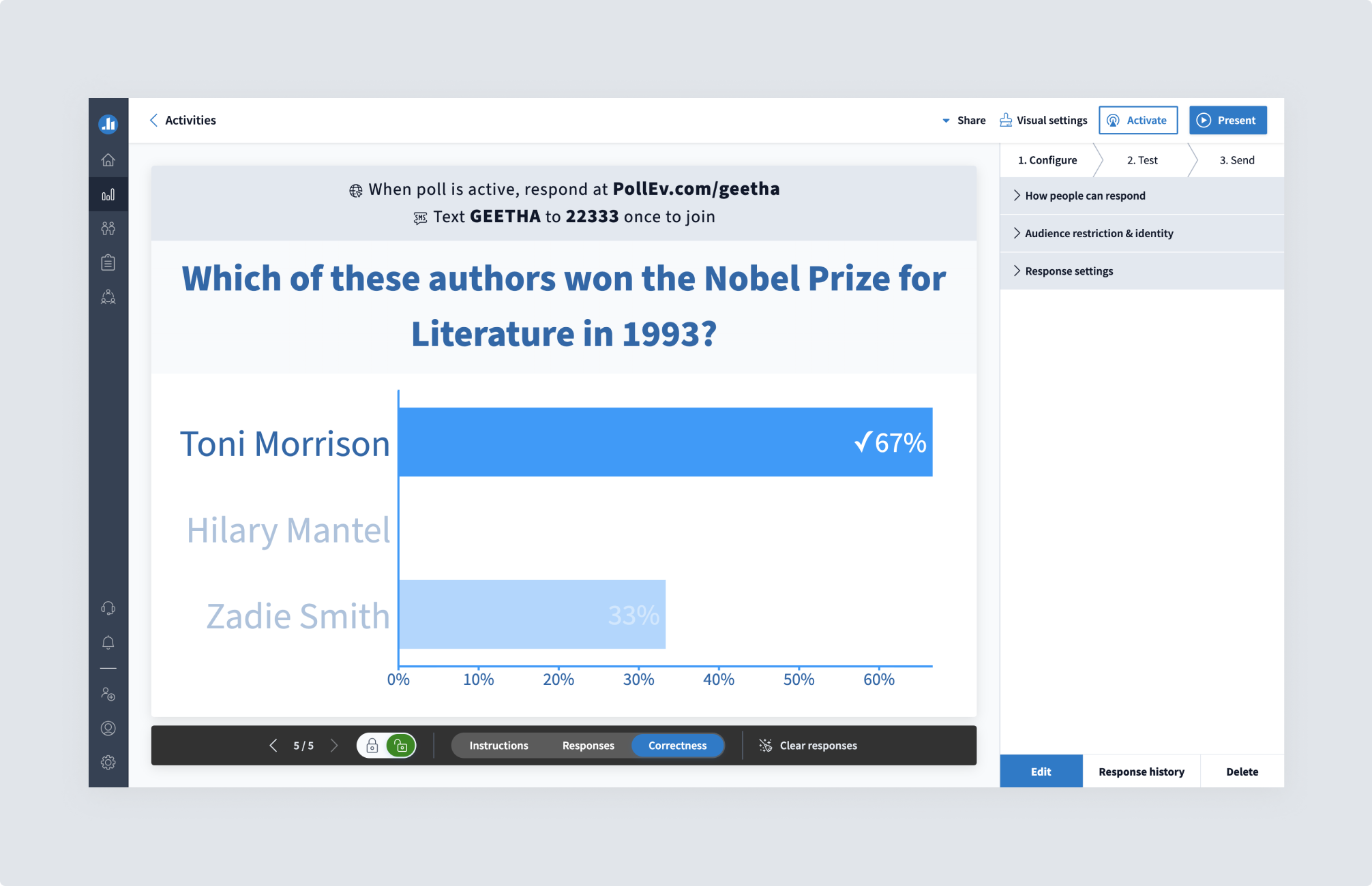
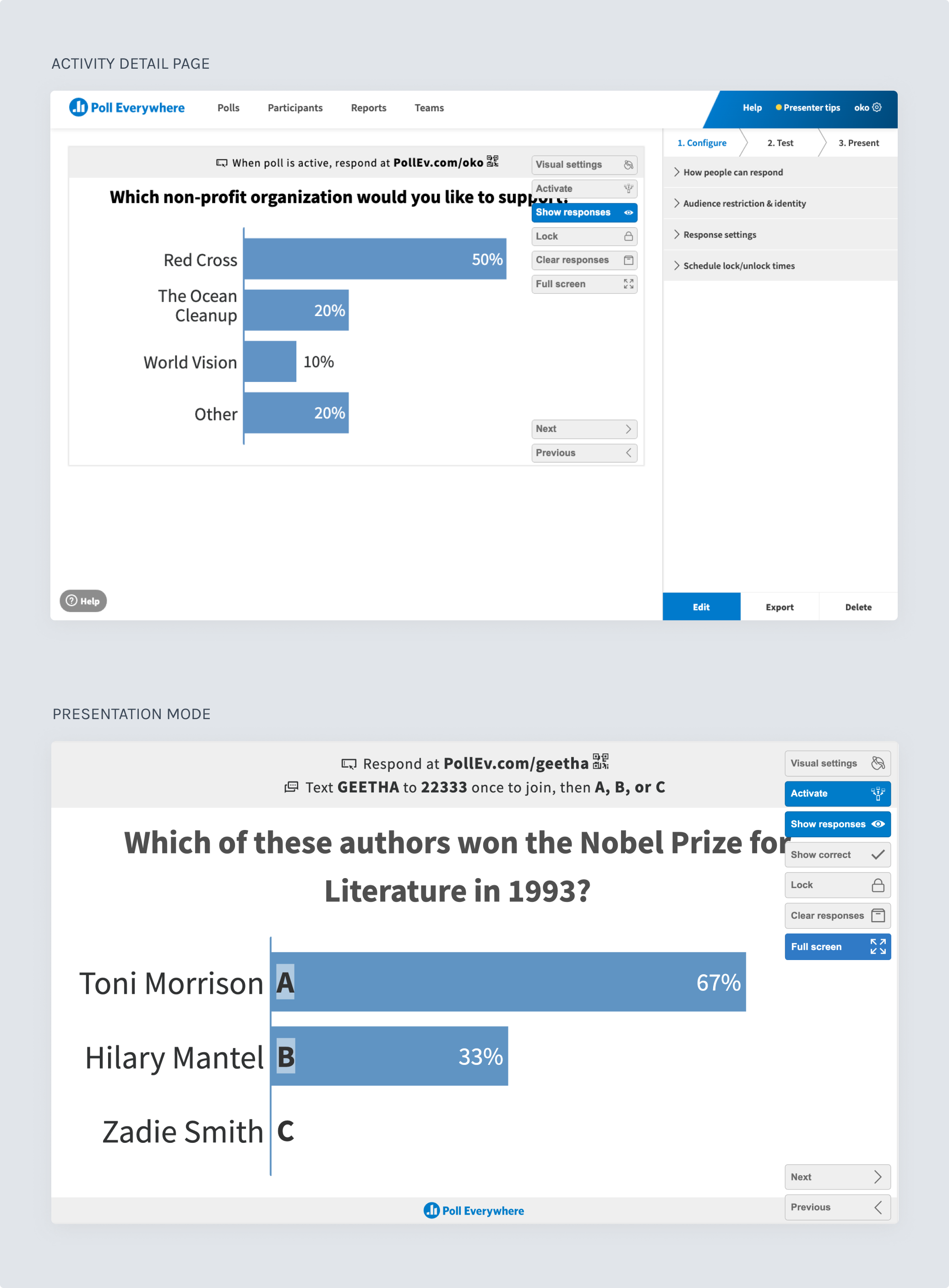
Poll Everywhere offers a live audience engagement tool that lets presenters connect with their audience via polls, Q&As, and other activities, sharing live results immediately. Customers include Google, Harvard, and Mutual of Omaha, among many others. A core set of controls, spanning two connected screens, let presenters manage their activity: locking a poll, resetting responses, and switching between views, showing just the question, showing live responses, or revealing correct answers. I led the redesign of these controls and their surrounding layout across both screens, working with a senior product manager, a front-end architecture lead, and a full-stack engineer. The work happened in phases over the course of a year, with our small team's time split across competing priorities.
Customer feedback had flagged the same issue for years: the controls were so large they covered the live results chart, the moment where a presenter's question and an audience's live responses visibly sync up in real time, the moment the product actually delivers on its promise. It was also a missed opportunity: since audience members often saw Poll Everywhere for the first time by watching it used in a room, a covered chart meant a lost chance to hook new customers, something stakeholders cared about as much as the usability issue itself. On top of that, despite having the largest market share in the space, the controls looked dated next to more modern-looking competitors.
Beyond size, the controls had a deeper problem: they didn't make clear what state an activity was in or what a given action would do, leaving customers guessing during live, in-front-of-an-audience moments. Fixing this meant rethinking how state was represented, not just cleaning up individual buttons.
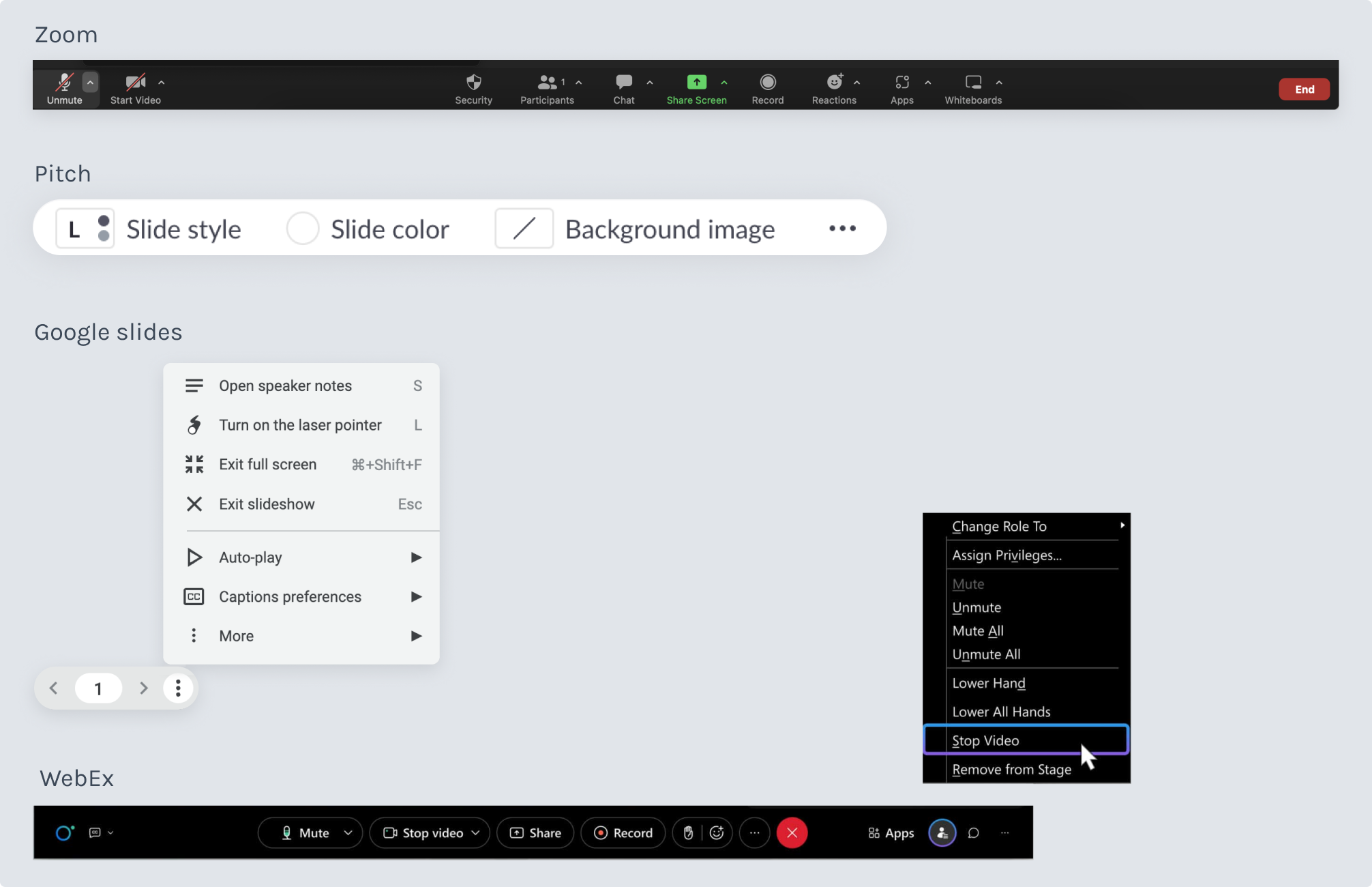
I briefly looked at several products in the same space, but they weren’t especially useful references, since our product’s mental model didn’t map cleanly onto theirs. It was more fruitful to look at products like slideware, which has a live presentation moment with both an “off-stage” and an “on-stage” experience, and live video conferencing software, which has a set of controls built for quick, easy use during a meeting or presentation.
I researched these tools to see how they organized their layout and controls in a way that had great usability while still feeling fresh and streamlined.
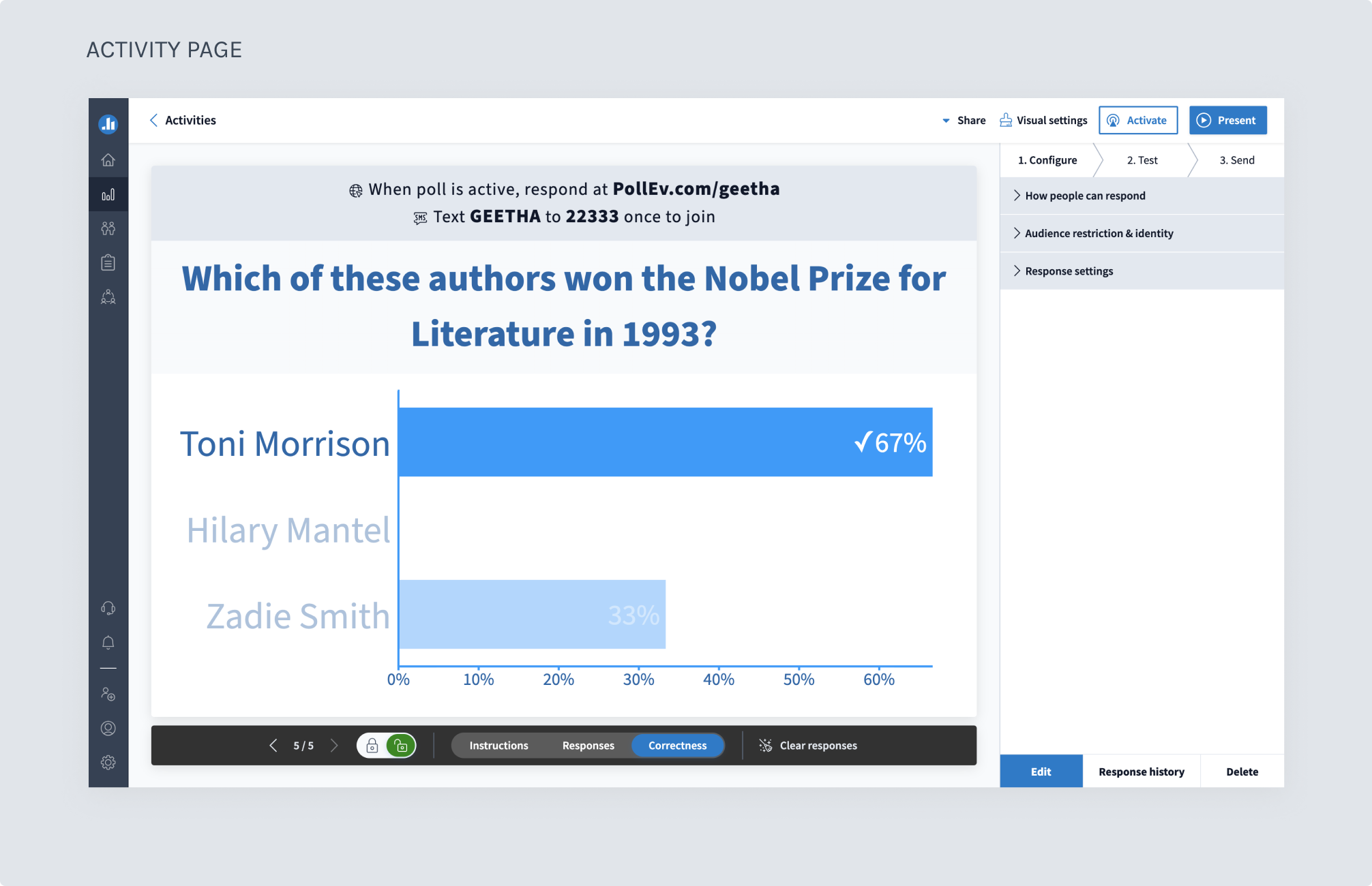
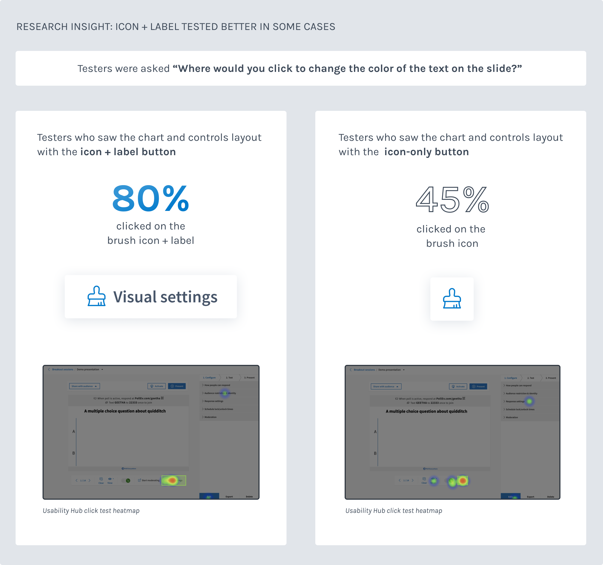
This project shipped in two six-week phases: the presentation controls first, behind a flag, then the activity page layout and reconfiguration in the second. Across both, I conducted more than 90 usability tests using Usability Hub, combining click-tests for usability, comprehension, and icon clarity with preference tests for visual choices like control bar color and iconography.
Testing drove specific design decisions: icons needed visible text labels to be understood reliably, and showing all possible activity states up front while tucking secondary presentation tools out of the way tested significantly better than the reverse. These findings directly shaped the final control bar and the Present, Activate, Share pattern that organized the activity page’s primary actions.
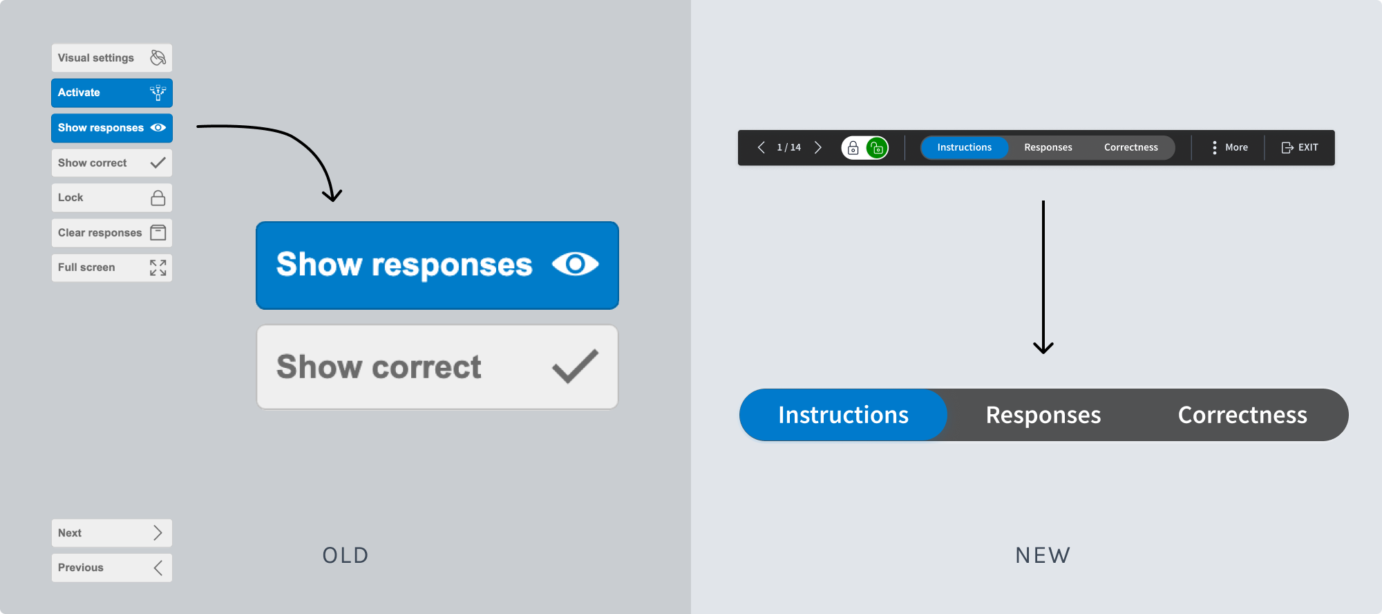
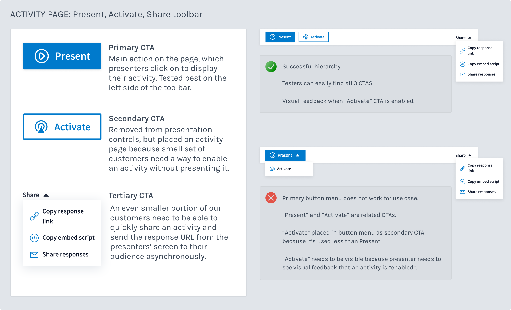
We shipped the new controls and activity page layout behind a flag. Our Head of Product was cautious about hitting customers with multiple major overhauls at once, since two other big changes (a new folder system and vertical navigation) were launching around the same time. A small cohort of customers saw the new UI, but we didn’t get meaningful data from that first release.
The delay turned out to be productive. I’d designed the Present, Activate, Share pattern as part of this project, and when a new vertical navigation shipped separately, the resulting topbar layout gave the controls, including the Present, Activate, Share pattern, more room to breathe. The three primary controls and visual settings could finally sit together without crowding each other, and the full design shipped as a more cohesive experience than the original flag release would have been.
Once the full design shipped, customer satisfaction scores showed a 21% lift over the old controls.