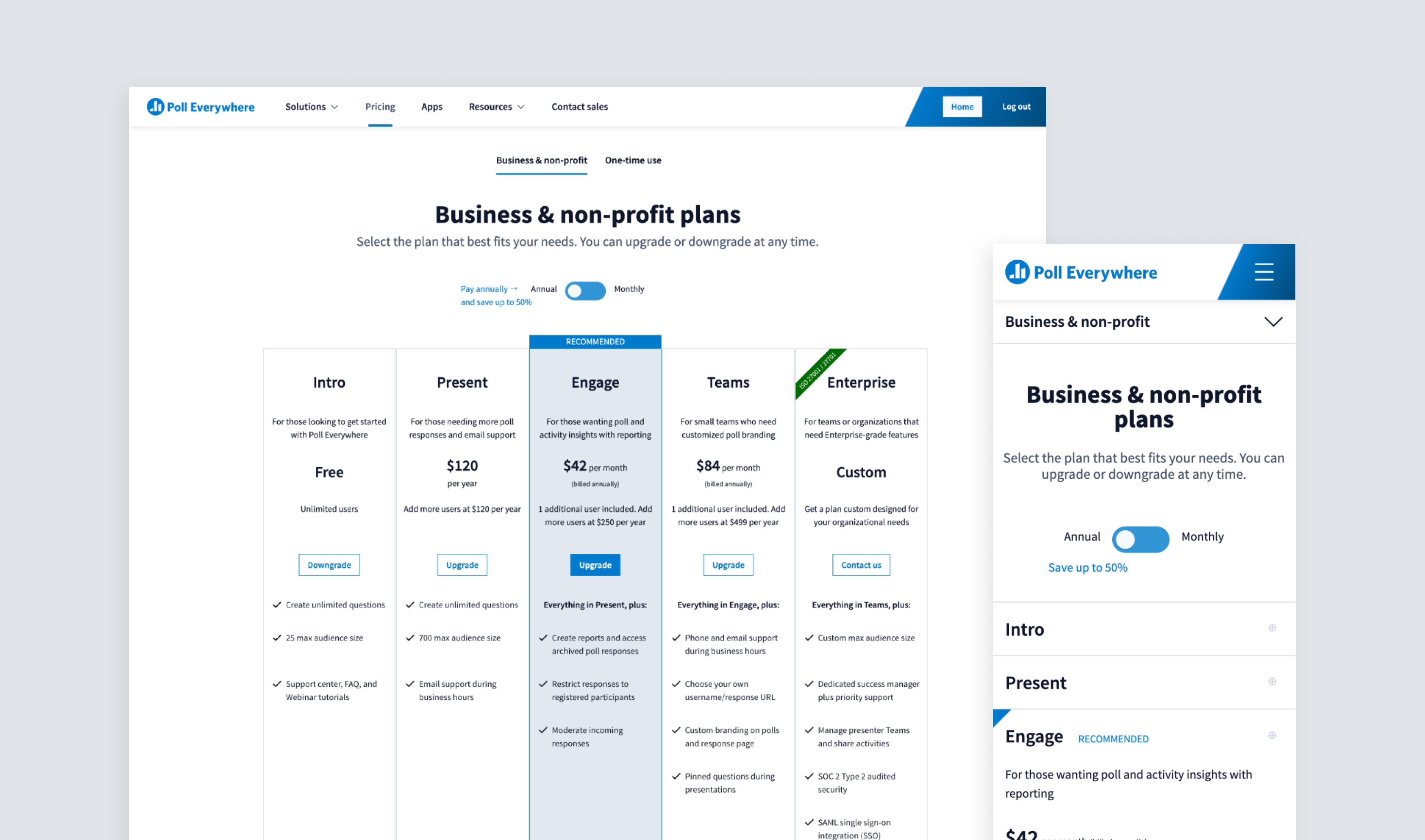
Poll Everywhere's plans page was in need of a full redesign. Potential customers struggled to compare features and benefits across plans, all of which were crammed into what felt like a never-ending comparison table. On top of that, the page was nearly impossible to view on mobile. The goal of this project was to increase the number of enterprise leads, as well as maintain or increase the number of retail paid plan sign-ups. I owned the redesign end-to-end, from research through design, testing and production, with the aim of arriving at a set of validated responsive designs to ship and A/B test over the course of a few months. My colleagues on the project were a project manager, a marketing manager who handled the copy, and a front-end engineer. The project took about three months total.
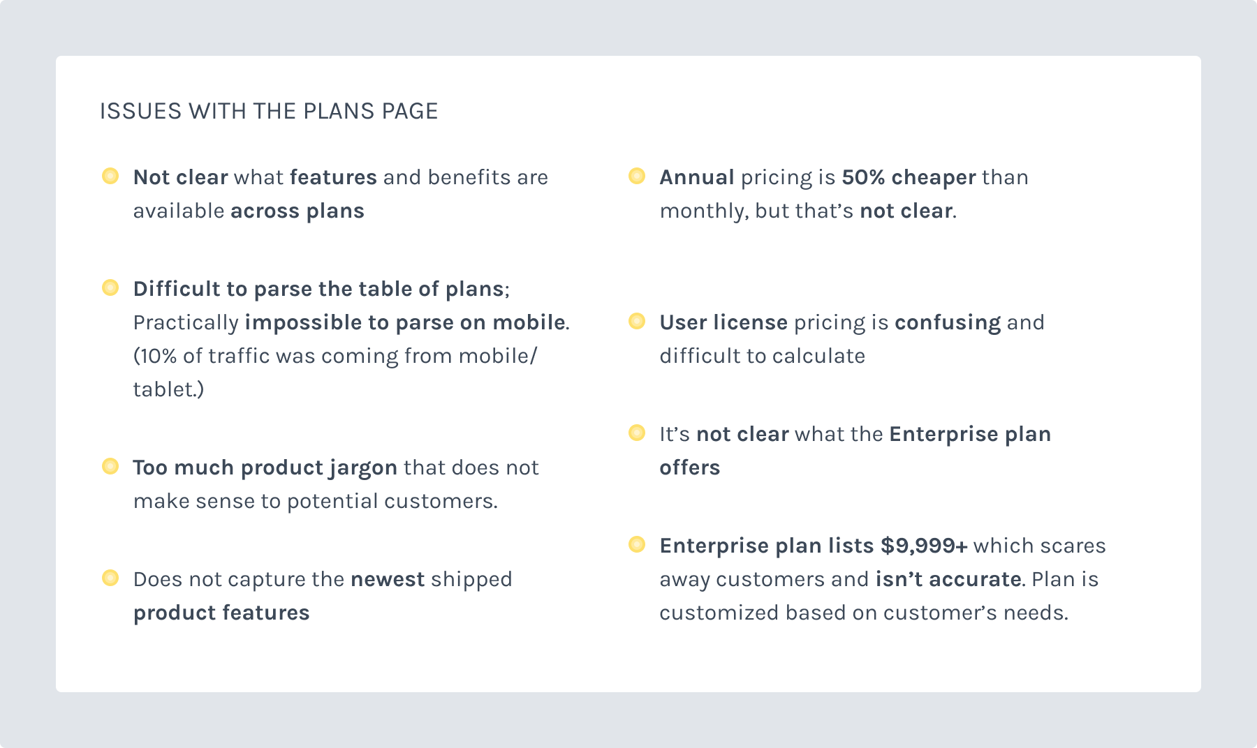
I spoke with my colleagues across the company from Sales, Marketing and Customer Service, who echoed a lot of the same issues with the plans page, which I've outlined in the image below. Major pricing plan changes were made earlier that year and there was no intention to consolidate the plans further.
Next I reviewed pricing pages across other SaaS companies, like Airtable, Campaign Monitor, Asana and more.
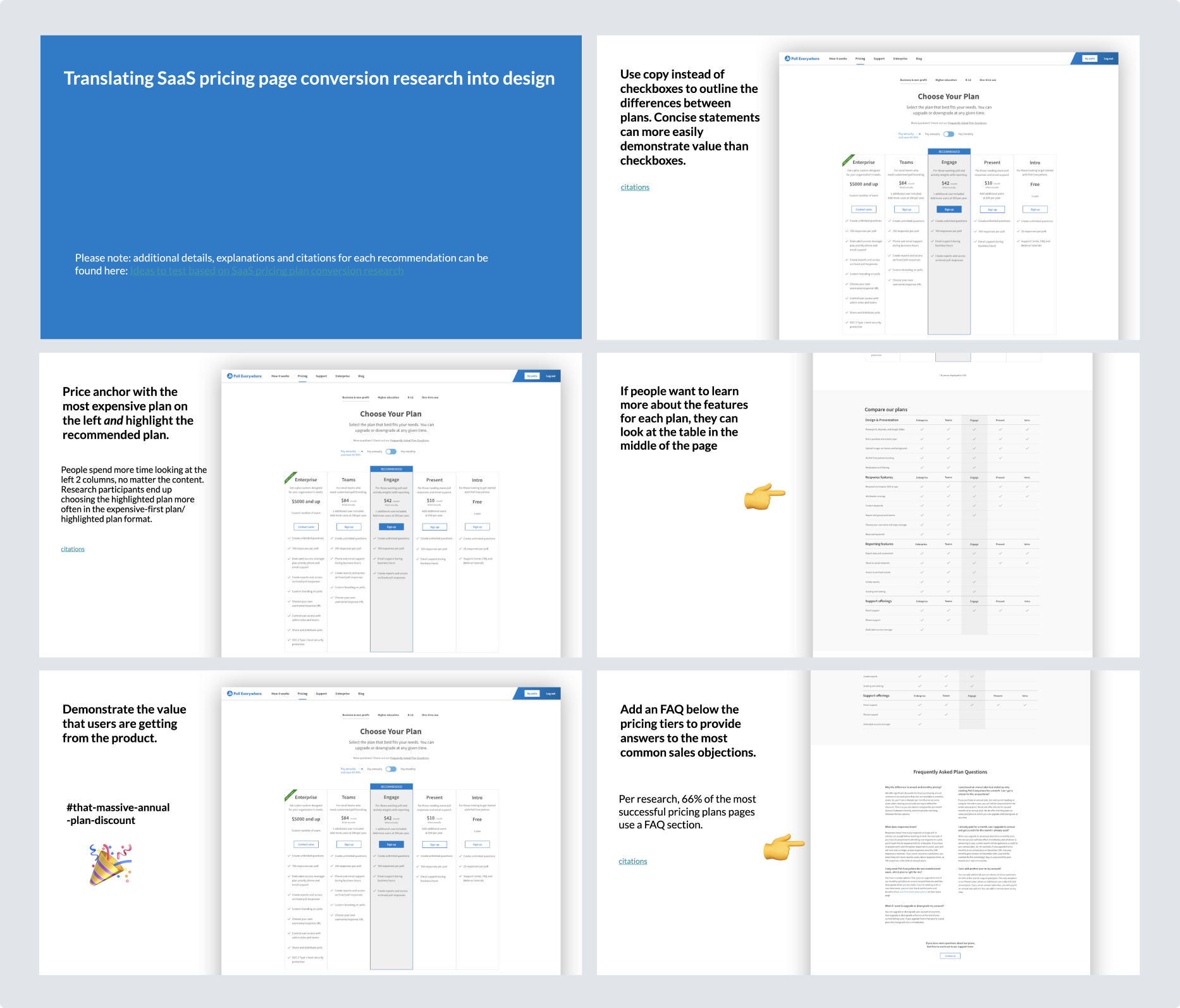
In addition to looking at different SaaS companies pricing pages, I conducted research on successful pricing page designs for SaaS companies. I reviewed and summarized the most pertinent ideas, including original research conducted by ConversionXL (now known as Speero). Then I outlined a set of design ideas that would be worth testing. You’ll see those ideas translated into designs more explicitly in the wireframe and early visual design section below.
Below is a short list of citations, though I reviewed more than the research listed here:
I started iterating on wireframes based on the ideas I wanted to test out based on SaaS conversion research. According to conversion research, anchoring the most expensive plan on the left along with a “recommended” plan led to more conversions on higher priced plans. I tried anchoring our Enterprise plan on the left and emphasizing the plan benefits. Each design tested a way to compare the same feature across different plans. All of the designs highlighted and anchored the recommended retail plan called Engage in the center.
I also experimented with different ways to layout the larger feature comparison table, as well as an FAQ section which would answer customers’ most common sales questions upfront. Furthermore, each plan had text at the top describing how it would benefit a specific customer type. My marketing colleague solidified this targeted copy.
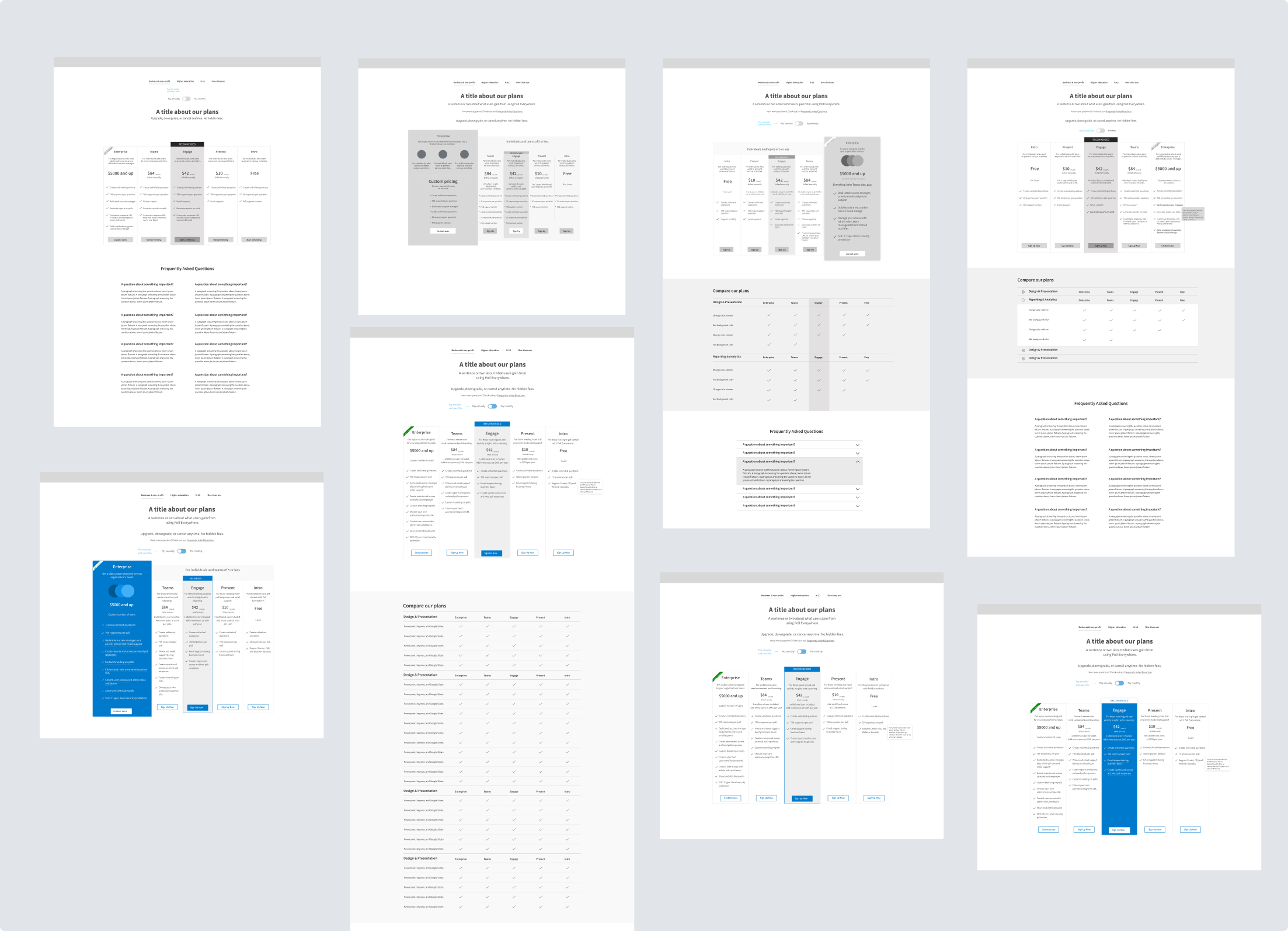
Based on both the research I studied and conversations with internal stakeholders, I narrowed down a set of 3 visual designs for preference and design comprehension tests. The large gray feature comparison table and FAQ sections already had tested well and were finalized so the top section with the plan columns was the primary focus of testing.
The 3 designs were:
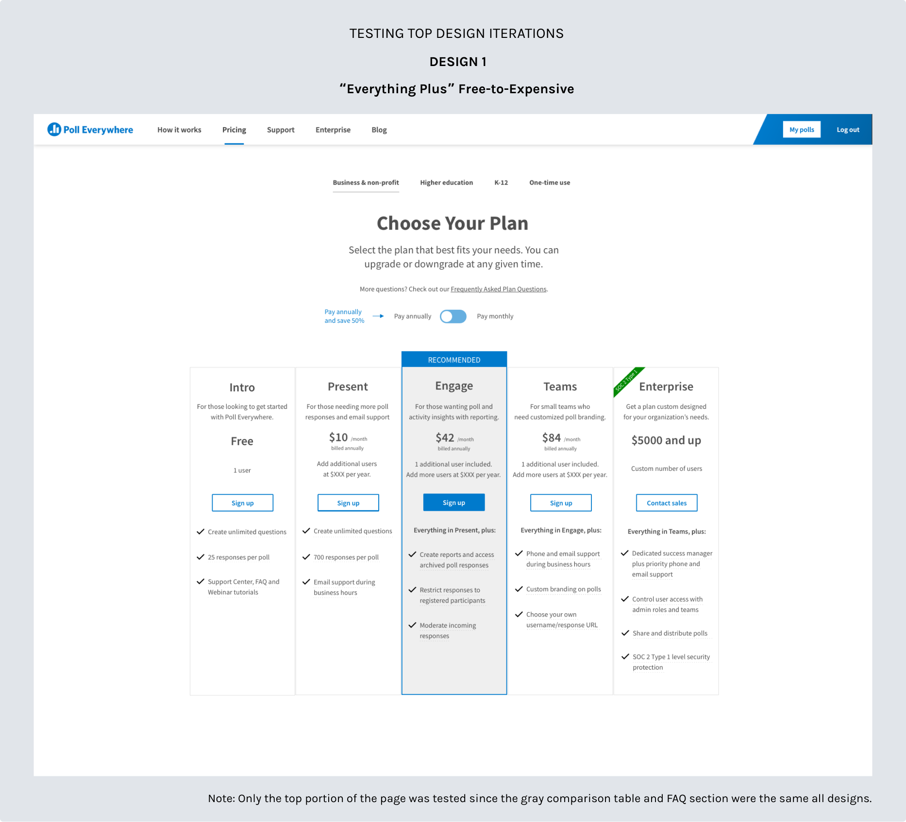
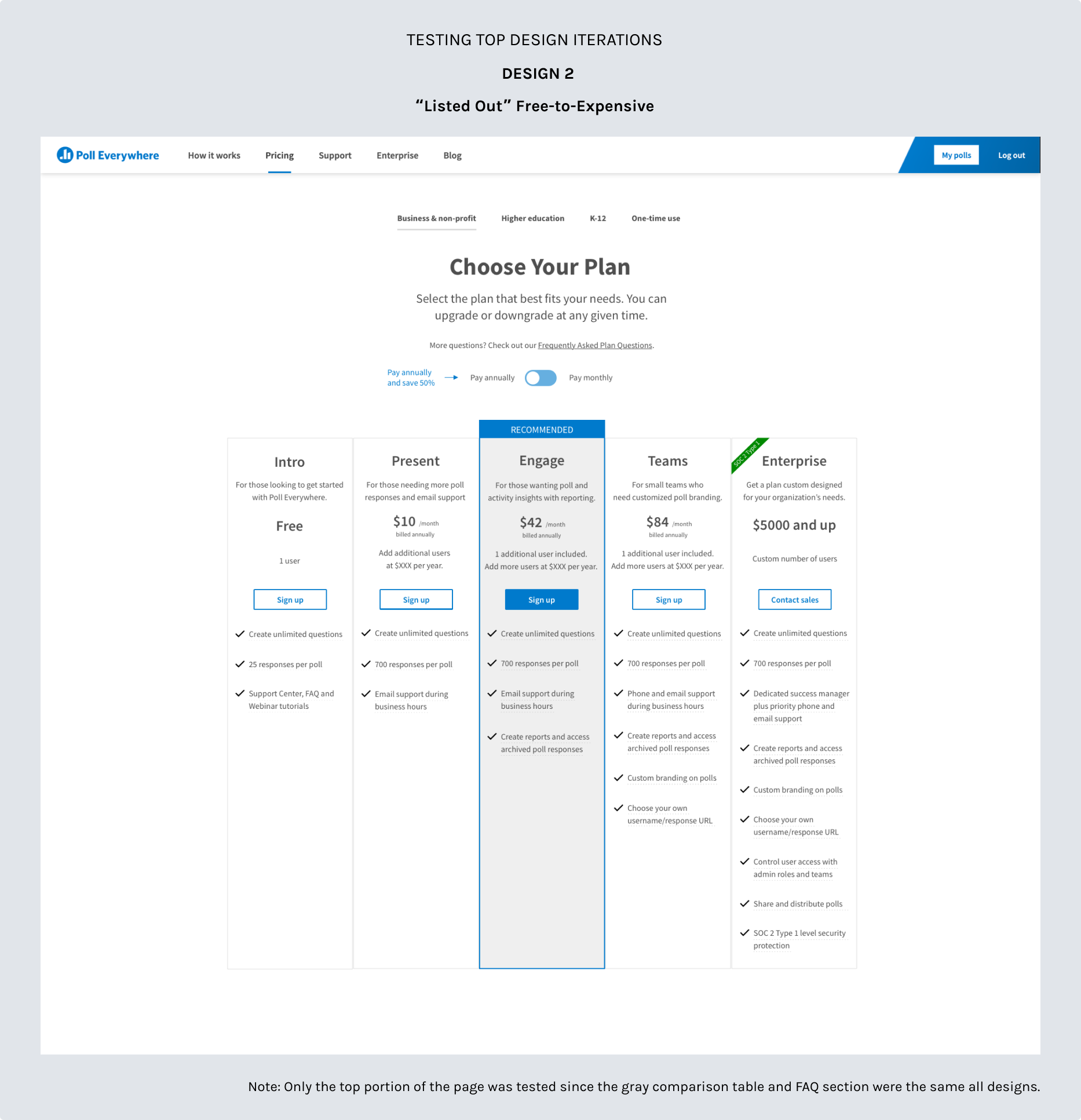
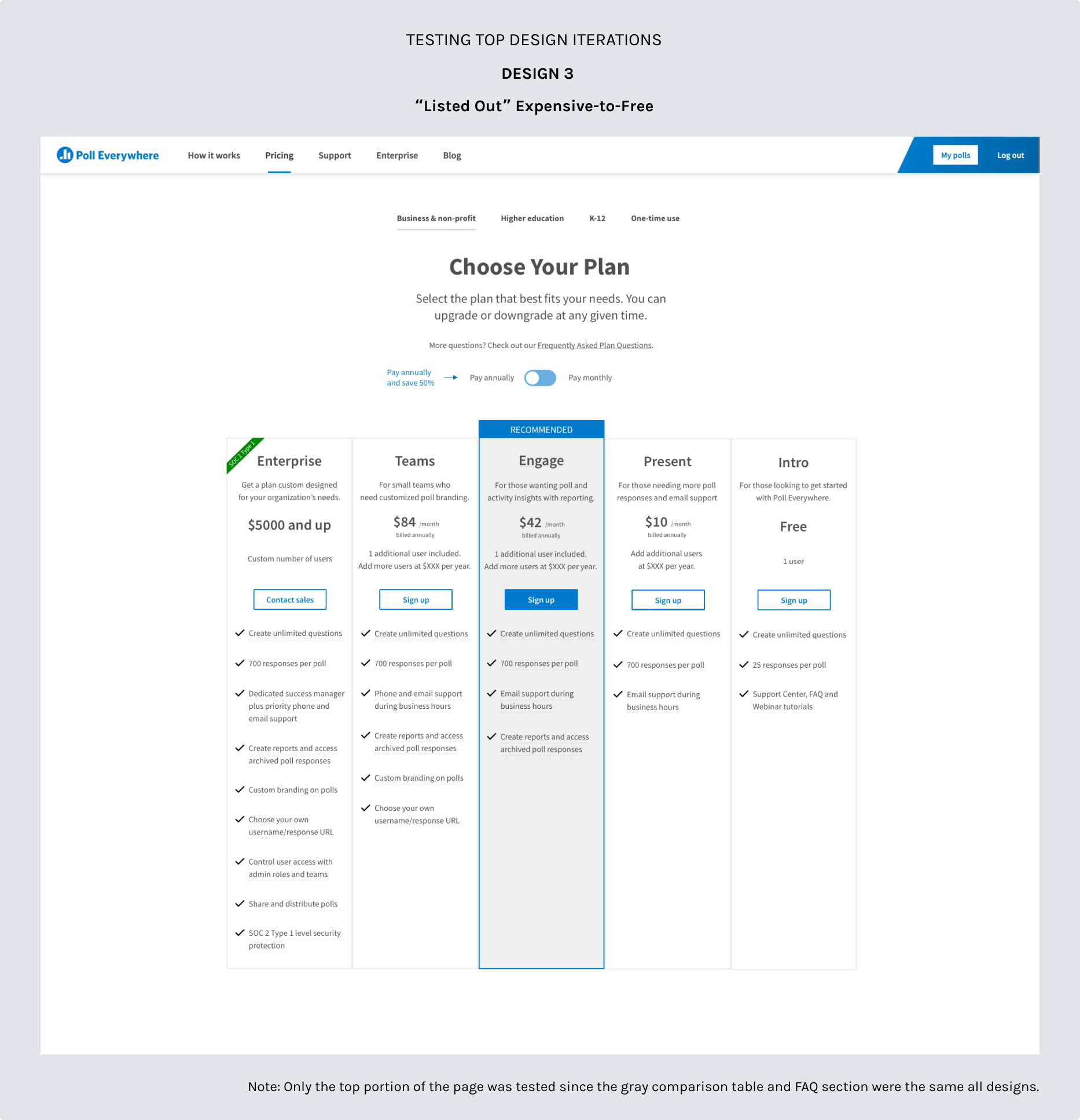
In different Usability Hub tests I pitted each of the designs against each other in 1:1 comparisons including the old plans page. Testers overwhelmingly preferred the designs which showed plans with free on the left to the most expensive on the right versus the opposite. There was a slight preference between “Everything Plus” Free-to-Expensive versus “Listed Out” Free-to-Expensive, though it was not statistically significant. Testers preferred “Everything Plus” over the old plans page design. I also used Jeff Sauro’s research and tools on Measuring U to understand the data.
With the design comprehension test on Usability Hub, I presented a single design and then asked testers various questions based on the design in front of them. For example: “Select all the plans that offer the Reporting feature.” or “Which plans allow audience members to respond to questions via the browser, SMS or the app?” The goal with each of these questions was to see how easily users would be able to identify and compare features between columns in versions that list out the features or in ones that add features to each column moving to the right (“Everything Plus”). All 3 designs plus the old plans page were tested.
Finally, I asked testers in every design test a scenario question that was meant to mimic the needs of an Enterprise customer. Then I asked them which plan would best meet their needs. Tellingly, above 70% of testers chose “Enterprise” for every design except the old plans page. Only 30% of testers reviewing the old plans page could figure out that “Enterprise” was the right plan for their enterprise needs.
I concurrently tested responsive designs for mobile size screens. Those tests were mainly focused on both comprehension and usability. For mobile, I landed on stacked plan columns and the FAQ section, but removed the feature comparison table as it was too much information to display on a small screen. This is a common practice for SaaS plan pages.
The shipped mobile page can be viewed in the video below or on Poll Everywhere’s plans page.
We initially planned to test several designs with A/B tests separately over the course of a few months. Since all 3 sets of designs fared decently well, my recommendation was to test all of them. However once we shipped the first design, “Everything Plus,” my product and marketing colleagues were so pleased with the results that they did not want to do additional tests with the other designs!
With the “Everything Plus” design, payment conversions went up by 32% and product sign-ups increased by 62% for retail. The number of Enterprise leads also increased.
You can view the page live on Poll Everywhere’s plans page or view the video below, which shows both the large screen and mobile plans page.
Note: I updated the footer design with another engineering colleague a few months later. You'll see that new footer on Poll Everywhere’s website and in the video below.