A solar battery management company came to Favorite Medium with a major ask: redesign their cumbersome, difficult-to-use solar battery platform. The existing product was burdened with complicated task flows, confusing interaction patterns and hard-to-find data, which made it very difficult for both new and existing user to use. These UX/design-related issues, as well as the outdated look-feel made it difficult to sell the product to utility companies and solar aggregators, which are the company’s main customer-base.
I was tasked with: delving into the current product to understand how the site architecture and existing user flows functioned, conducting customer and stakeholder research to better understand user’s needs and pain points and learning about how the existing product fit into users’ day-to-day workflow. From here, I would redesign the site architecture and all the key screens of the product, in some cases creating new screens to fill-in existing gaps within the existing product.
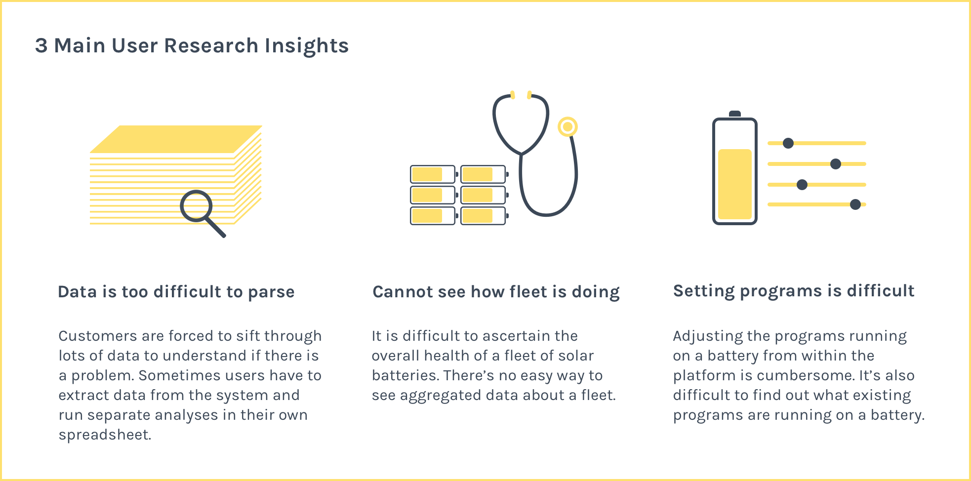
I conducted remote semi-structured interviews with the company’s customers and internal stakeholders over course of a couple weeks. We used Google Hangout and Skype for these calls, which allowed customers to walk us through the platform and show us problematic sections and interactions. Below is a graphic showing the main points learned from the interviews.
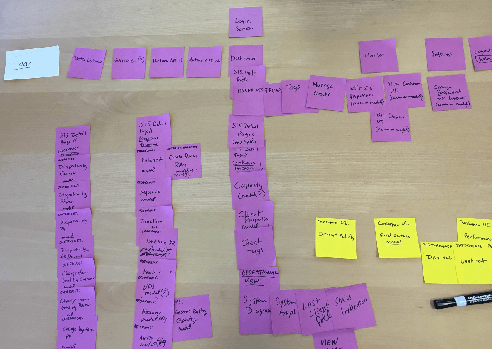
Concurrently, I delved into the existing product with walkthroughs from product experts within the company. I also mapped the sitemap of the existing product and conducted a heuristic analysis.
The main insights from those processes were:
Based on insights garnered from user research, we created the following design principles which served as guide rails during the UX/UI design process.
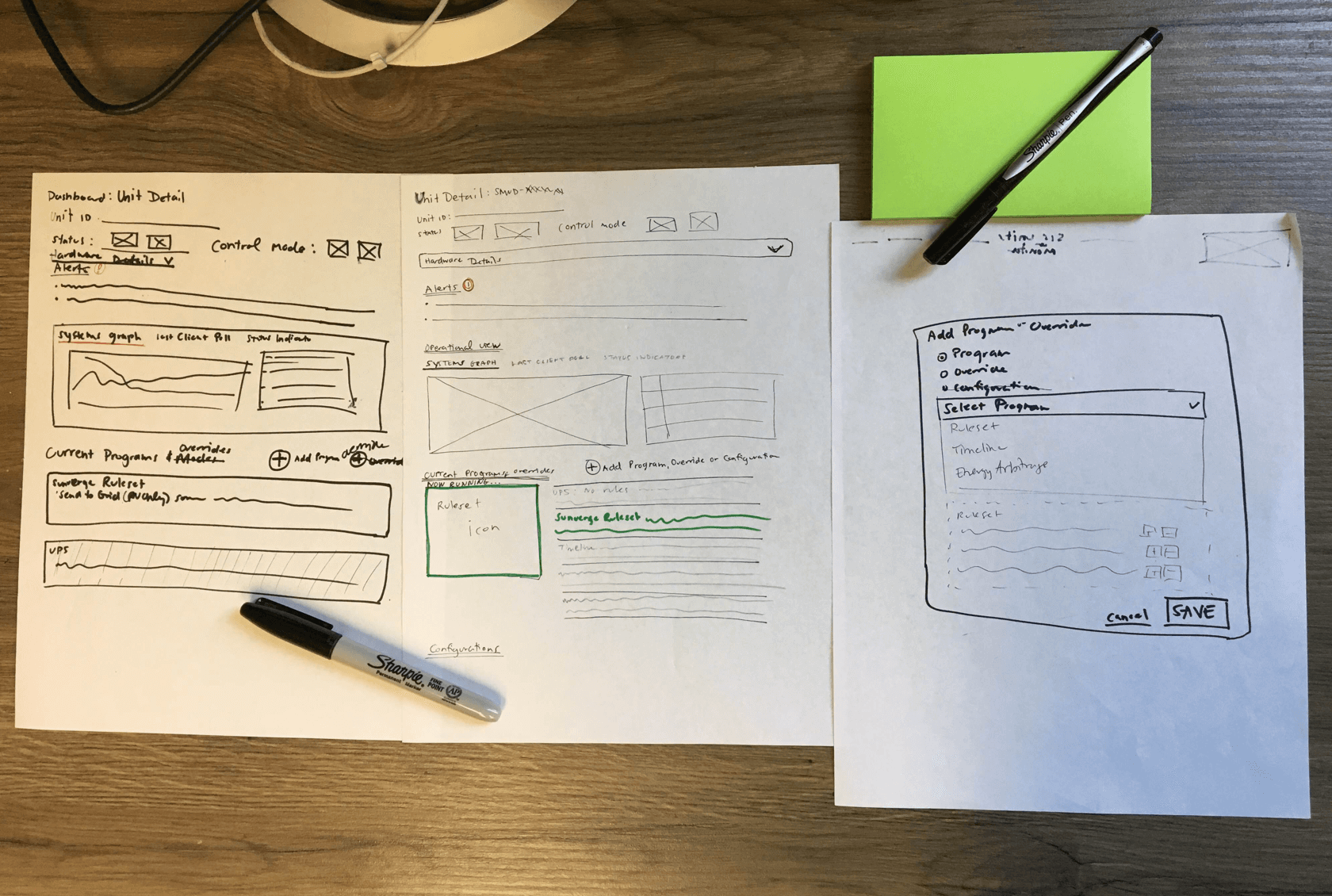
Due to the complexity of the product, I started by first exploring how to organize the vast amount information in the system by creating preliminary content block sketches and wireframes to explore the high-level organization and hierarchy.
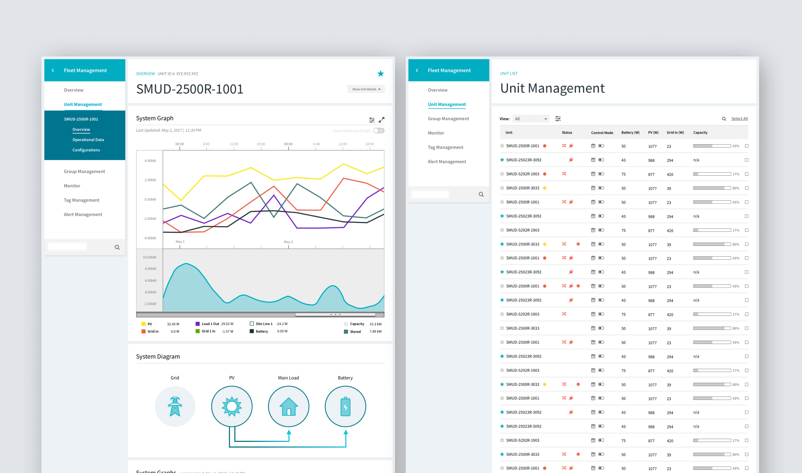
In line with the design principles, I focused on determining how to highlight only the most pertinent actionable information for user, and giving them clear paths to delve deeper into the data if necessary.
Rather than using incredibly long pages with stacked information, we explored different UI patterns, that would contain a primary content section with other pertinent information organized in a rail on one side of the screen.
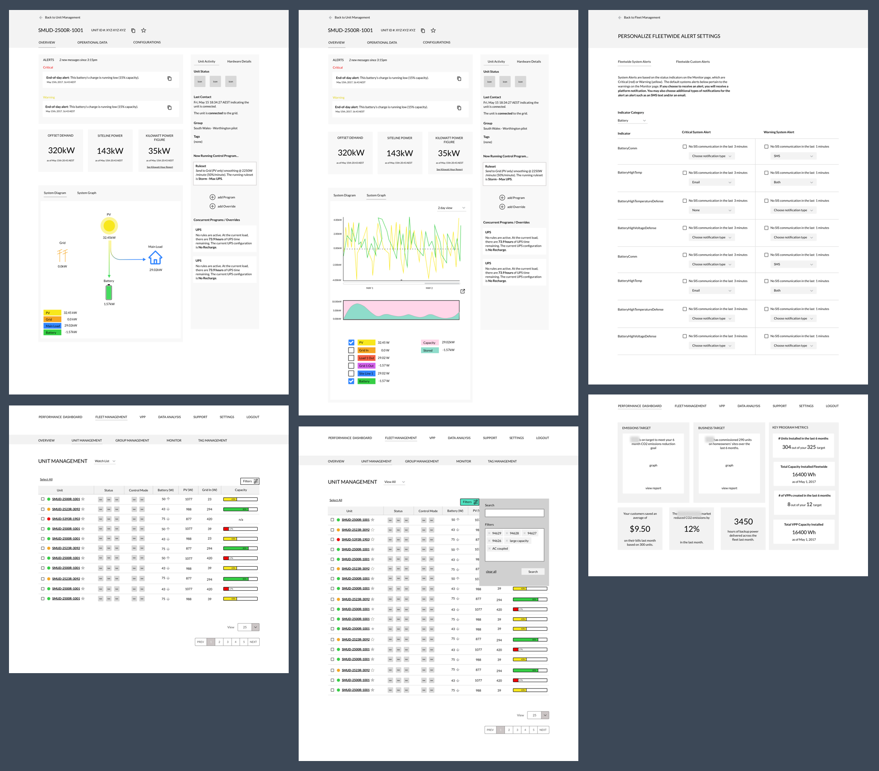
In some cases, long tables and lists were still appropriate for displaying information, when users needed to delve deeper into data or review a set of solar battery units. Unlike in the existing system, these lists needed to be filterable, sortable and searchable. We explored different search patterns, as well as the search terms customers may use to find specific units, unit with specific characteristics, units in a specific postal code etc.
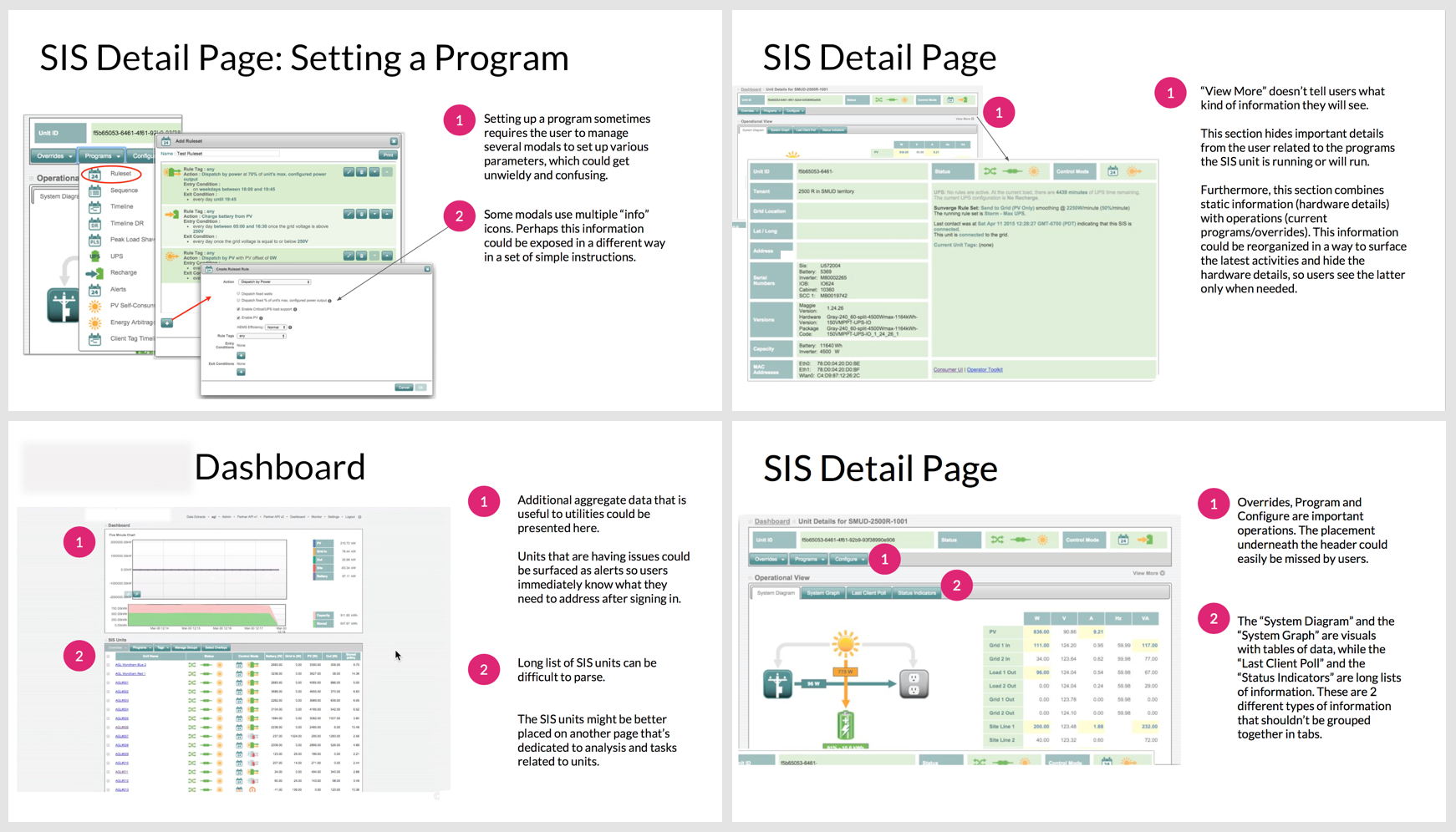
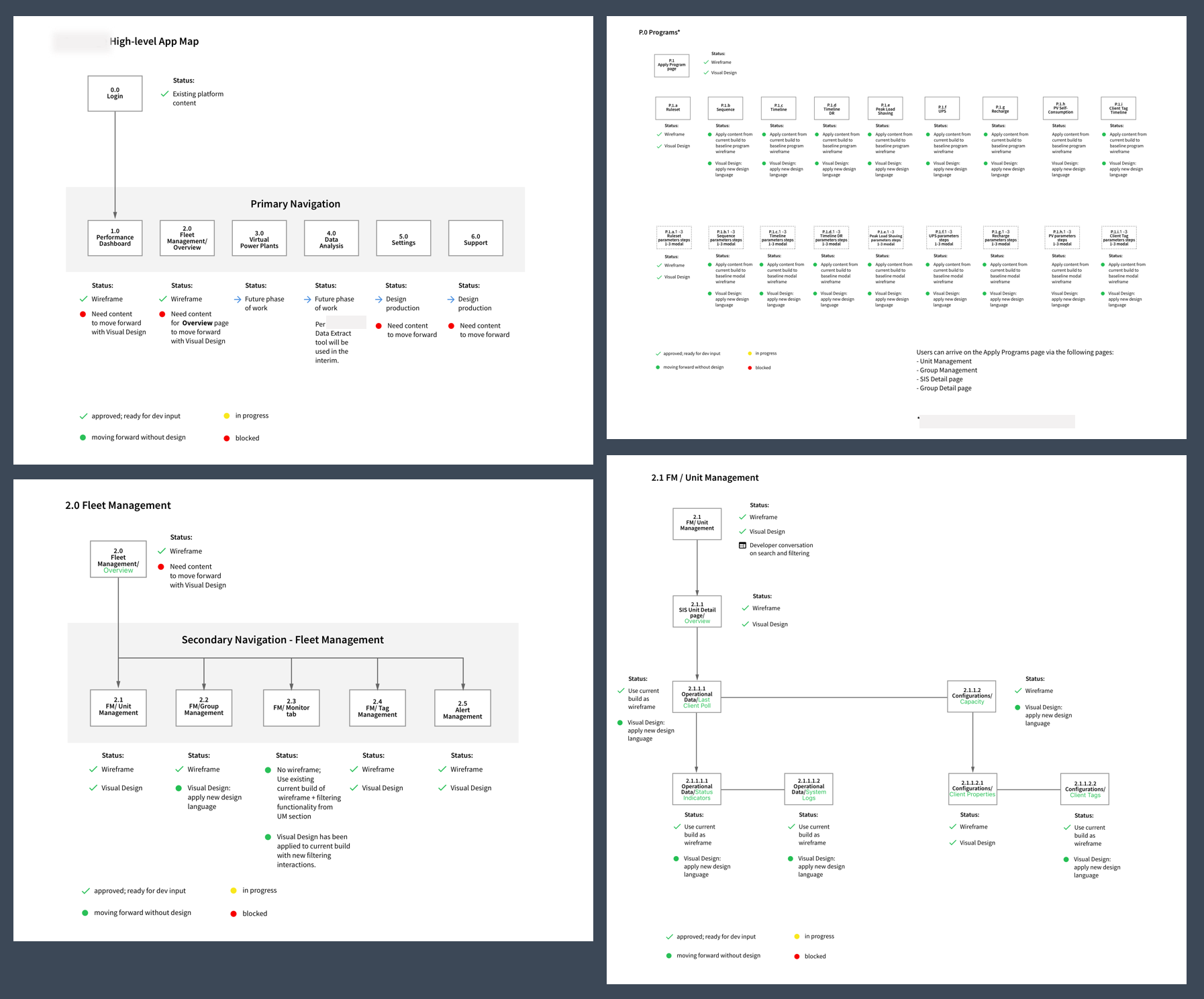
I worked closely with the company’s product manager on this project. We developed a side-by-side comparison between the existing product and the newly designed product in order to highlight how the new design solved a myriad of problems. After we received client buy-in for several of the key screens, I created a screen inventory to show the design status of each screen, as well as what design patterns would be applied to existing product screens.
Furthermore I added developer notes to all the wireframes and visual design comps created by my visual design colleague. To prepare for the development phase, I also created user stories and tickets for our developers.
While the redesigned product contains most of the same info as the original product, it’s much more streamlined, providing clearer paths for users to find information and take action. Furthermore, rather than overwhelming users with data, we created a layers of screens with actionable aggregate data with clear paths for users to delve deeper if they need to do so.